Zevia
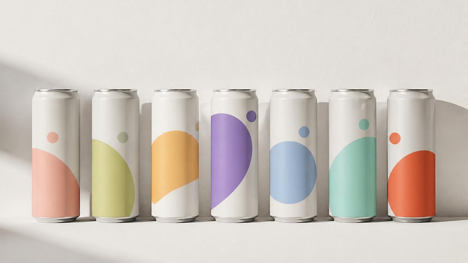
Colour is the argument. Structure is the proof. Everything else is noise we chose not to print.
A packaging system built to make a zero-sugar soda feel like the loudest thing on the shelf.
The brief was deceptively simple: keep the flavour-forward energy people already loved, but give the range a structure that could scale to dozens of SKUs without turning the shelf into noise.
We built the system around a single fixed anchor — a locked type lockup and a consistent silhouette — then let colour do all of the flavour work. Each variant gets one saturated field and one supporting tone, so a twelve-pack reads as a gradient rather than a collision.
Photography was shot flat and bright to match, with product treated as graphic form instead of a hero object. The result holds together at three feet and still rewards a close read.
- Client
Zevia
- Year
2023
- Role
Art Director
Designer
- Services
Packaging
Art Direction
Photography